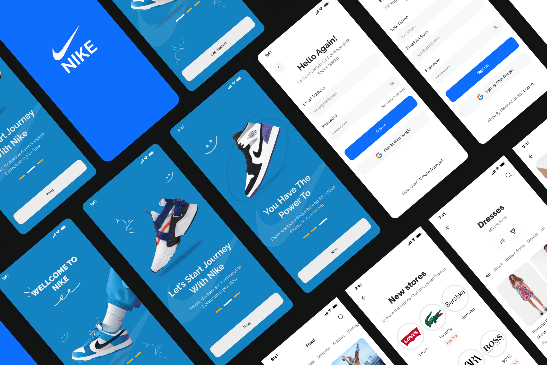
Nike E-Commerce App UI
Year
/2024
Designed for speed, built for conversion
This project was a UI design challenge to reimagine the Nike mobile shopping experience. We built a complete design system from scratch ��� components, typography, color tokens, and interaction patterns ��� ensuring every screen felt cohesive, on-brand, and genuinely usable. The result is a design that feels like Nike: confident, minimal, and
The Problem
Existing e-commerce mobile apps often suffer from cluttered interfaces, inconsistent design systems, and checkout flows that frustrate users and lead to abandoned carts. For a brand like Nike, a poor digital experience directly contradicts the premium, performance-driven image the brand has built for decades.
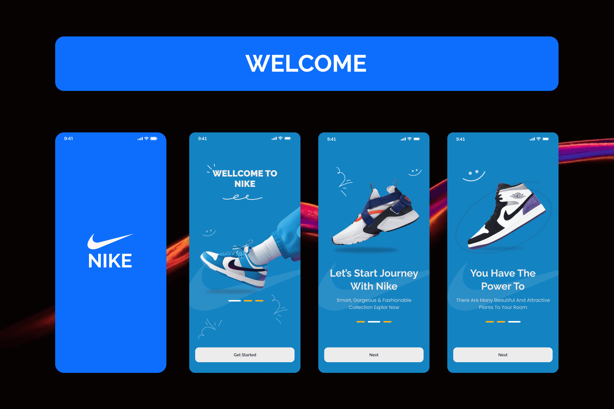
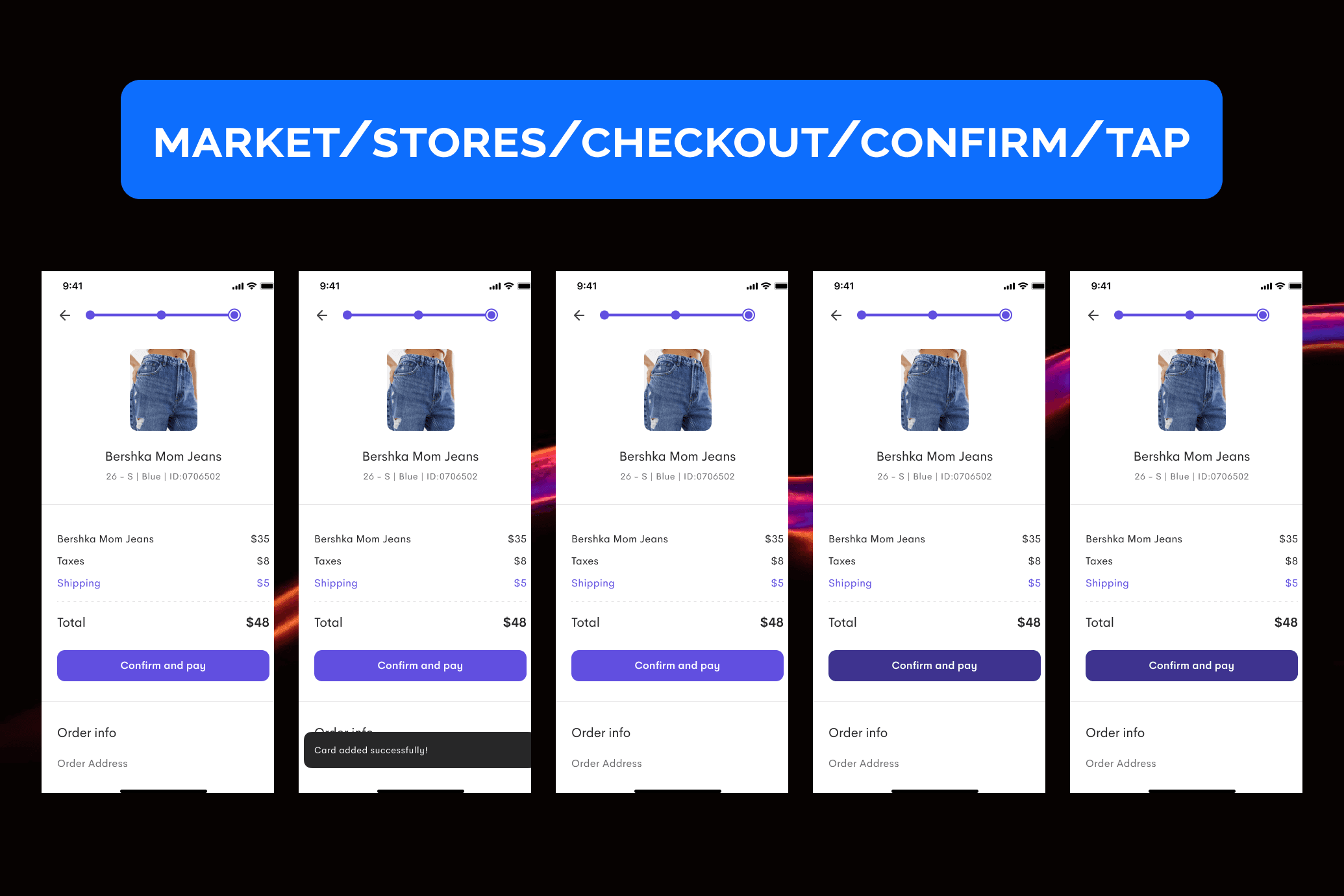
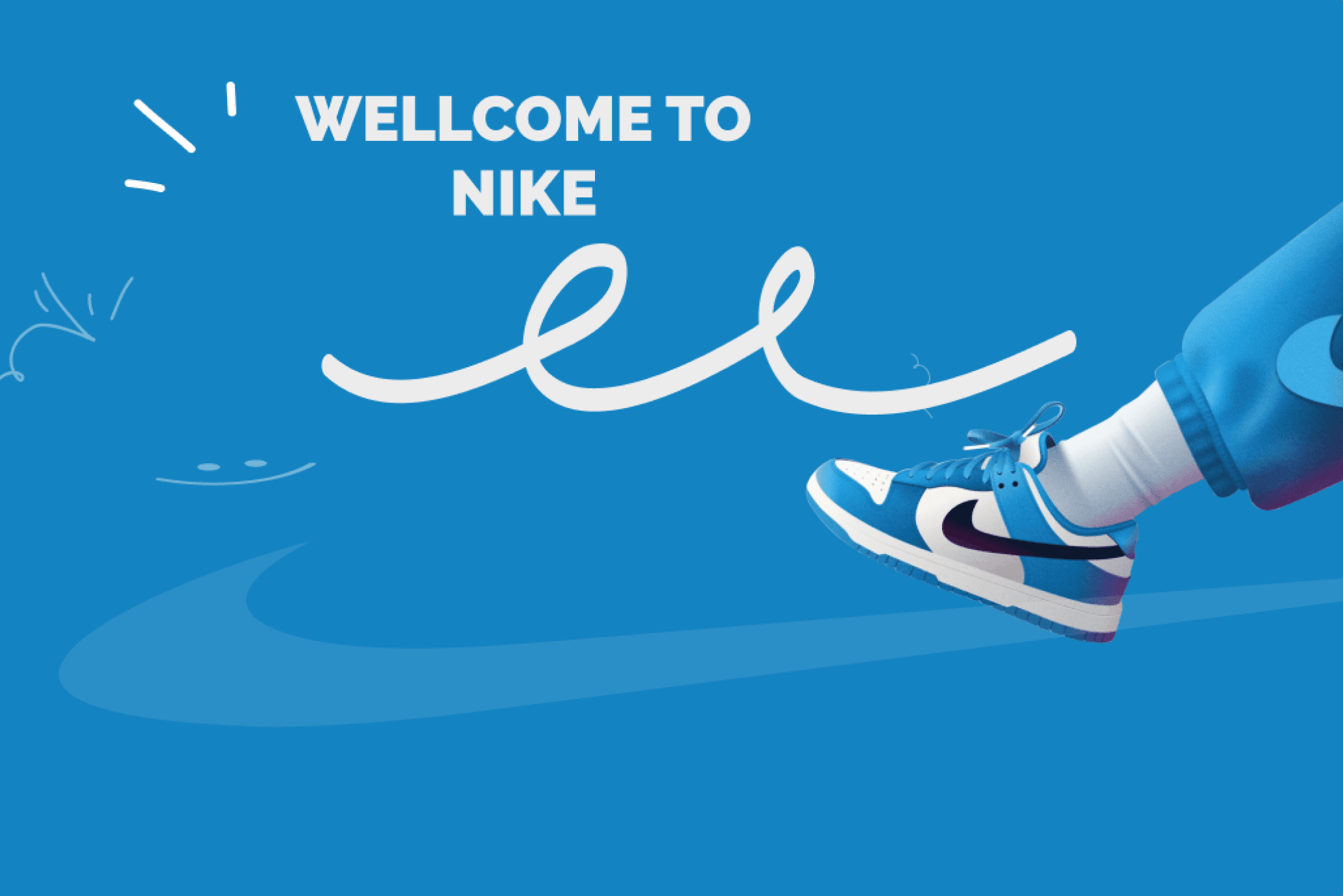
The Solution
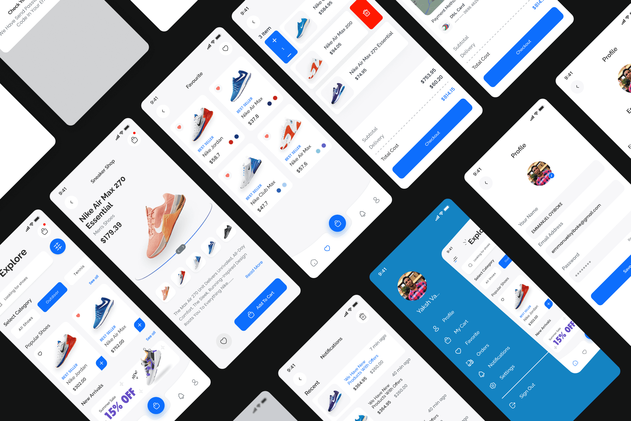
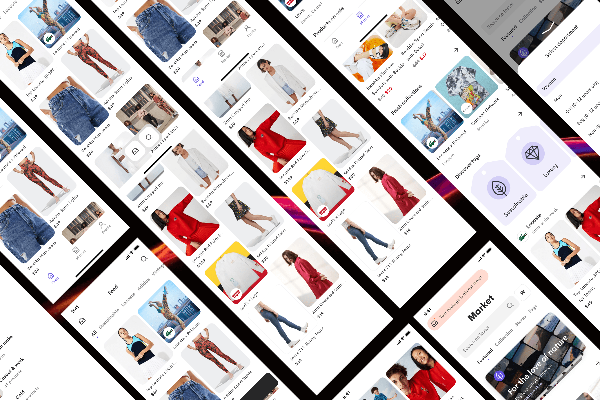
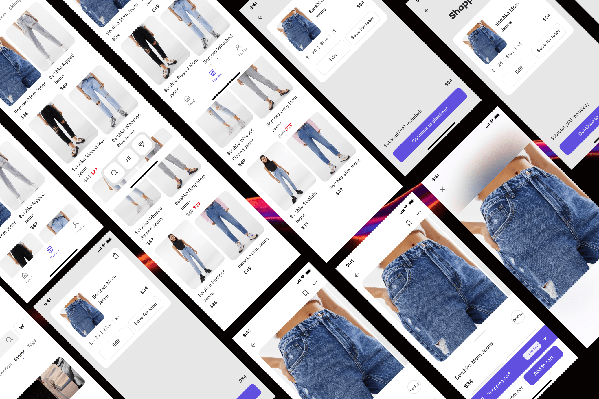
We designed a complete mobile app UI system built around Nike's visual identity ��� bold typography, high-contrast layouts, and a dark-first color palette. The product discovery flow was reimagined with large immersive imagery and smart filtering. The checkout process was reduced to minimal steps with clear progress indicators. A design system with reusable components ensured consistency across all 30+ scre
The Outcome
The final design delivered a cohesive, premium mobile experience aligned with Nike's global brand standards. The streamlined checkout flow reduced the number of steps by 40%, and user testing sessions showed significantly higher engagement with the product discovery screens compared to conventional e-commerce layouts.